7FACTOR NEWS

Understanding How Flex Works
By Katie Kang
To be most efficient in mobile design, you must familiarize yourself with Flex. It will save you time, and more importantly headaches. Flex is useful if you want to create a responsive UI for all devices. I highly recommend using Flex instead of setting specific values between elements such as paddingRight: 50 to give a space, as it won’t create a responsive UI, since there are so many devices out there with all different screen sizes. I will be going through a few key examples of using Flex and explaining how these are beneficial in mobile design. These are all basic designs that will set you up for success within Flex!
Getting Started
We will be using <View> and a few other components to demonstrate some examples. <View> is similar to <div> in HTML. Note <View> is neither a string nor HTML, it’s called JSX. Instead of using plain HTML, you will need to use JSX in React Native. For more information about JSX, click here. There are more of these, such as <Text> and <TouchableOpacity>. All of these are called Core Components and it will come in handy to learn these before viewing my examples. Click here to learn more about Core Components.
Example #1: Using SafeArea for 100% Screen Coverage
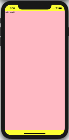
<SafeAreaView> is used for the latest iOS devices where the front camera takes up a large partition of the front screen, I.E.: iPhone 11, 12, X, Xs, and XR. What is happening here is that the <SafeAreaView> component takes up the entire screen, including the status bar area. Because we’ve applied flex: 1 in <SafeAreaView>, it takes the entire screen including the status bar area top and bottom. Then it renders the <View> area where it takes up the area without the status bar which is why you see the yellow background on the top and the bottom of the screen. <View> is on top of <SafeAreaView> so if you remove <View>, then you will see only the yellow background color applied to the entire screen. So think of flex: 1 as width or height 100%.
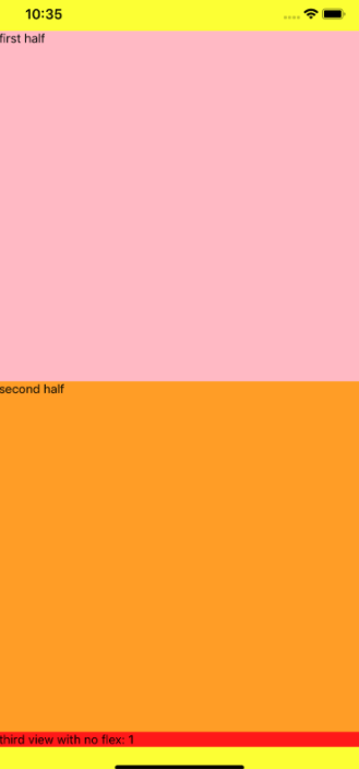
How to create two <View> areas and divide the screen exactly in half? As we saw the example above, flex: 1 is like width or height: 100%. Then what happens if we do this?
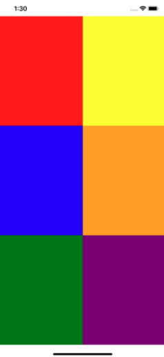
Example #2: Creating Horizontal Sections
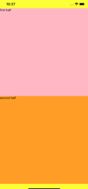
Flex will automatically break down the entire space in <SafeAreaView> to exactly in half. Can you guess what happens if you add one more <View style={{ flex: 1 }}>? It will break down to 33.3% for each <View>, because each <View> must have 100%, but there are 3 <Views>, so it will do the hard work for you. Then what happens if you add <View> but no flex: 1? The last <View> will take up the needed space, and then the two flex views will share the remaining space evenly.
Diving Deeper
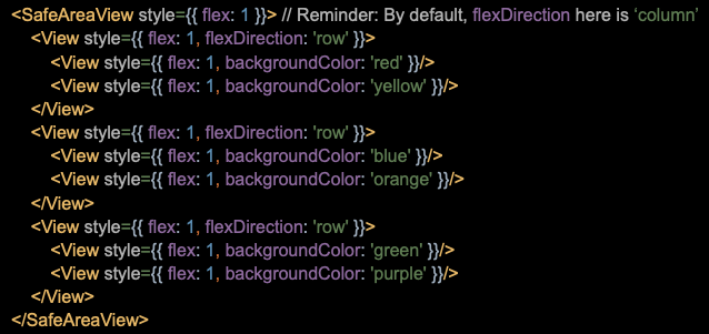
Also, by default, the direction of flex in React Native flex is ‘column’, not ‘row’. It is opposite to what you see in React CSS. What do I mean by that? Here is an example.
Example #3: Understanding ‘column’ and ‘row’.
We’ve applied flex: 1 and instead of using the default ‘column’ direction, we are using ‘row’ direction for <SafeAreaView>, so the entire screen is one big fat row going left to right. It gets confusing, but remember, the entire screen is one row! Imagine you have one really long yellow strip inside a black box and you are only seeing a small portion of it — which is your mobile screen. In ‘row’ direction, you can add items from left to right. In ‘column’ direction, each component will stack from top to bottom. When you apply ‘row’ or ‘column’ direction, everything inside that component will get affected. Here, we have ‘row’ direction applied in <SafeAreaView>, so any child component will stack up items from left to right. See the next example of how I created 3 rows and 2 columns. The key point is that the parent’s flexDirection will affect its children component.
Adding Adjustments
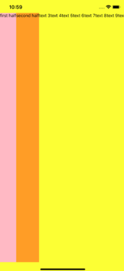
Okay, so you understand that the above example shows the entire screen as one row, and since it’s ‘row’ direction, each component within <SafeAreaView> parent component will render from left to right. Then what about the text 10 and text 11 that got cut off? Because of flexDirection: ‘row’ and flex: 1, items are rendered from left to right, and there’s not enough space for those two texts to display on the screen. If we change <Text>first half</Text> to some really long text, the rest of <Text> components will not show at all. Also, don’t get confused with small texts. You might think you have plenty of space available below those texts, but as you can see with the background color, each text takes up a thin slice of one big yellow row. We just have too much-unused space for small texts, because of flex: 1 in <SafeAreaView>. The text by default is justifyContent: ‘flex-start’ aligned, meaning it is top-aligned vertically. Don’t worry, we’ll cover this in example #4.
So, where are the rest of the texts? It overflows to the outside of the screen to the right. Think of each <Text> item as a small box. Right now, we have 11 <Text>, thus 11 boxes, but think of an extreme case where you have 100 boxes or 100 <Text> items. Will it display all here? Certainly not. We’ve already used up the available space. The mobile devices are small and you have limited spaces. In the real-world, cramming everything in one row like this is a bad design that you want to avoid. Back to the solution. To fix this, you can add flexWrap: ‘wrap’ and it will ‘wrap’ the remaining text that doesn’t fit in the first row. Whether you applied flex: 1 or not, it will still do that.
Let’s Kick it Up a Notch
If you understand flex and flexDirection, the rest is easy. See more example code below and try to see if you can do similar or even more complex things. I highly recommend using backgroundColor everywhere, because you can visualize the area that’s being affected.
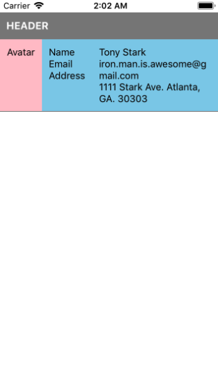
Example #4: Adding User Profile Information
Let’s look at a more real-world example. What if you want to create a header and content with a user’s avatar on the left and their information on the right? Here is one way of doing that.
The pink and sky-blue areas below are nothing different than the example above with lots of text. The entire pink and sky blue area is one giant row, and we are simply stacking up elements from left to right. And the email and address area is just taking up the remaining space by using flex: 1.
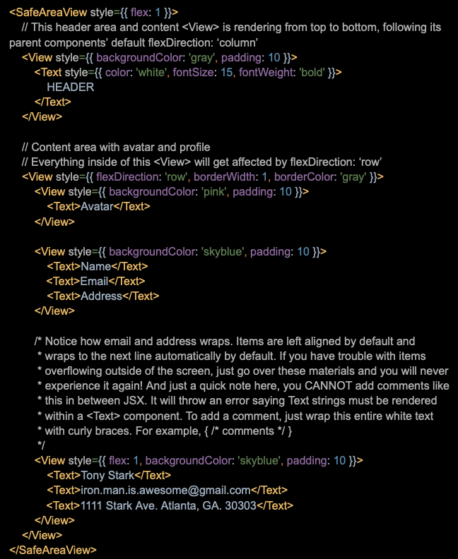
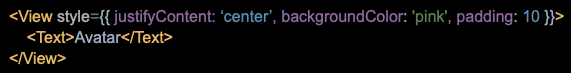
Okay…. So what do you do if you want to vertically center ‘Avatar’ text? You can use justifyContent: ‘center’ to do that. If you want to replace Avatar text with an image, the same principle applies; you can still use the same style.
To align items horizontally centered, use alignItems: ‘center’. Think of justifyContent as a y-axis and you move items top, center, or bottom aligned using that. The same goes for alignItems; it’s like the x-axis, moving items left, center, or right. Value for the left, or right alignment is not ‘left’ or ‘right’, it’s ‘flex-start’, and ‘flex-end’. So you would do justifyContent: ‘flex-start’ or alignItems: ‘flex-start’. I know, it’s confusing at first, but just play around with it for a bit.
So far, we’ve covered the most frequently used features of flex. If you got all of these, you won’t have much trouble when building a UI. Just think carefully about how you are going to write the code when you have a complex design. Start from putting everything in the imaginary boxes. I use backgroundColor very often so that I can visualize items and it helps me to correct any mistakes in the early development stage. It gets pretty messy when the design has so many items in multiple layers of <View>.
I hope this overview helps you on your Flex journey! Remember to start small and remember the basics.